visual branding


Gymstudio
At the heart of GymStudio's visual identity lies a striking logo—a perfect harmony of form and function. The logo, featuring a bold circle with a vibrant half-circle beneath, captures the essence of movement, energy, and progress. It symbolizes the unity of strength and innovation, reflecting GymStudio's commitment to revolutionizing gym and studio management.
Accompanying this iconic logo is a carefully curated color palette that embodies the spirit of GymStudio, with the leadership of its parent company, TeamBuildr. The deep navy exudes professionalism, stability, and trust, while the lively orange injects a sense of vitality, excitement, and motivation. Together, these colors create a dynamic contrast that commands attention and leaves a lasting impression on users.
In addition to the logo and color palette, the GymStudio visual identity is characterized by abstract minimalism, modern typography, and intuitive design elements. Every detail is thoughtfully crafted to enhance usability, evoke emotion, and reinforce the brand's identity in the gym management industry.


Plyomat
Plyomat's visual identity revolves around a captivating logo—a fusion of sleek design and dynamic energy. The logo features a bold light blue "P," adorned with lightning bolts along its stem. This distinctive emblem not only pays homage to the company's name but also encapsulates the essence of Plyomat: power, speed, and performance.
Complementing the logo is a carefully chosen color palette that sets the tone for the Plyomat brand. The light blue hue conveys a sense of tranquility and clarity, evoking the feeling of soaring through the sky. Paired with accents of white and charcoal, the palette exudes a modern, high-tech aesthetic that aligns perfectly with Plyomat's innovative approach to jump mat technology.


SmartHome
The SmartHome logo features a sleek house silhouette, adorned with three dynamic lines extending outward. Each line represents a core aspect of the SmartHome’s experience: control, automation, and intelligence.
The house symbolizes the concept of home—a place of comfort, security, and belonging. It serves as the foundation upon which SmartHome builds its innovative solutions, aiming to enhance the quality of life for homeowners around the world.
The three lines emanating from the house embody the interconnectedness of SmartHome’s smart devices. They represent the seamless flow of information and communication between devices, enabling users to control and automate various aspects of their homes with ease and efficiency.
The choice of neon yellow and black for the logo's colors is deliberate and symbolic. Neon yellow, with its vibrant and electrifying hue, symbolizes innovation, creativity, and the dynamic nature of smart home technology. Paired with sleek black accents, it conveys a sense of sophistication, modernity, and reliability—qualities that define the SmartHome brand.
The logo was created to reflect SmartHome’s commitment to pushing the boundaries of what's possible in the world of smart home technology. It serves as a visual representation of the brand's mission to empower homeowners with intelligent, intuitive, and interconnected solutions that enhance their everyday lives.


HealthPoint
The HealthPoint logo embodies a symbol of care, efficiency, and accessibility. The logo features abstract shapes meticulously arranged to form the silhouette of the letter "H," representing HealthPoint's commitment to health and well-being. The soft blue and green colors chosen for the logo evoke feelings of serenity, trust, and vitality, reflecting the calming and nurturing environment associated with healthcare.
The abstract nature of the logo serves to convey HealthPoint's versatility and adaptability in meeting the diverse needs of healthcare professionals and patients alike. Its fluid lines and shapes symbolize the seamless integration and coordination of medical appointments and scheduling, facilitating a smooth and efficient healthcare experience for all.
The choice of green represents growth, renewal, and vitality, reflecting HealthPoint's mission to promote holistic well-being and support the growth and development of healthcare practices. Soft blue conveys tranquility, trust, and reliability, emphasizing HealthPoint's commitment to providing a secure and dependable platform for medical scheduling and appointment management.
The logo was created to encapsulate the essence of HealthPoint—a brand dedicated to enhancing the efficiency and effectiveness of healthcare delivery while prioritizing the needs and experiences of both healthcare providers and patients. It serves as a visual representation of HealthPoint's vision to empower healthcare professionals to deliver high-quality care and improve patient outcomes through innovative technology solutions.

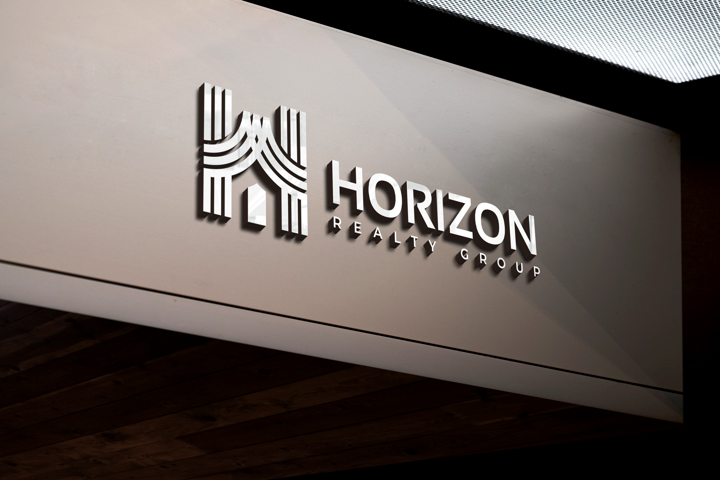


Horizon Realty Group
A symbol of integrity, professionalism, and the pursuit of new horizons in real estate, this logo features multiple lines meticulously crafted to form the letter "H," with the central portion of the "H" transforming into a silhouette of a house. This design encapsulates Horizon Realty Group's commitment to guiding clients towards their ideal homes and investment opportunities, symbolizing the journey from aspirations to reality.
The choice of gold and black for the logo's colors is purposeful and symbolic. Gold represents prestige, prosperity, and excellence, reflecting Horizon Realty Group's dedication to delivering top-tier service and unparalleled results to clients. Black embodies sophistication, elegance, and authority, underscoring the trust and confidence that clients can place in Horizon Realty Group as their partner in real estate ventures.
The logo was meticulously crafted to capture the essence of Horizon Realty Group—a brand synonymous with integrity, reliability, and excellence in the real estate industry. It serves as a visual representation of Horizon Realty Group's mission to provide unparalleled service, expertise, and guidance to clients navigating the complexities of the real estate market.